
It’s been a while since I posted a step-by-step piece, mostly because I get so into the painting process I forget to photograph my steps. But I’ve been painting more and more pieces in acrylic using more of a watercolor painting style and thought I’d share my latest piece. Yes, you can water acrylic paint down to the consistency of watercolor as long as you follow a couple of simple rules – 1. paint on a watercolor surface (I prefer Ampersand Aquabord) and 2. seal the painting with non-diluted acrylic medium or varnish at the end, to ensure proper adherance.
Why not just use watercolor? For me, using acrylic like this has many advantages, including the ability to paint more opaquely when needed and keep layering without worrying about previous layers being lifted (you still have to wait till the layers dry, but it doesn’t take very long). Yet I still get the softness of watercolor on my edges if I want them, and I don’t have to worry about the workability of the acrylic paint, like the dreaded “tacking up” feel of acrylic in the drying process.
If you are interested in exploring this style of painting after reviewing the step-by-step photos below, I recommend the book “Acrylics The Watercolor Alternative” by Charles Harrington, which really opened my eyes to the flexibility of watering down acrylic paints. Enjoy!
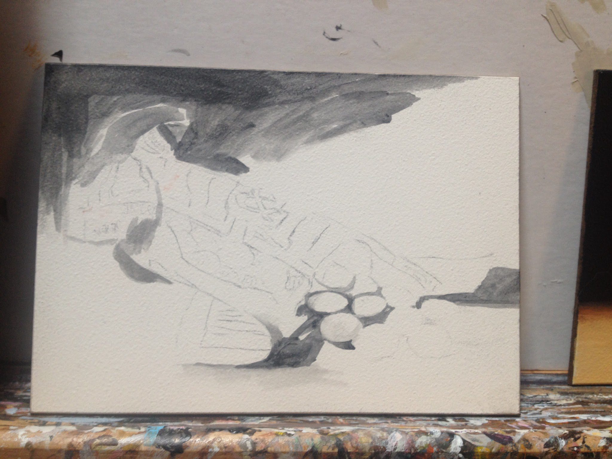
1. I start most of my paintings with a basic outline of the main shapes and an underpainting mapping out the darks. I always mix my blacks, which makes for more richness and less of a flat feeling. For this piece, my “black” is mixed from Ultramarine Blue and Raw Umber.
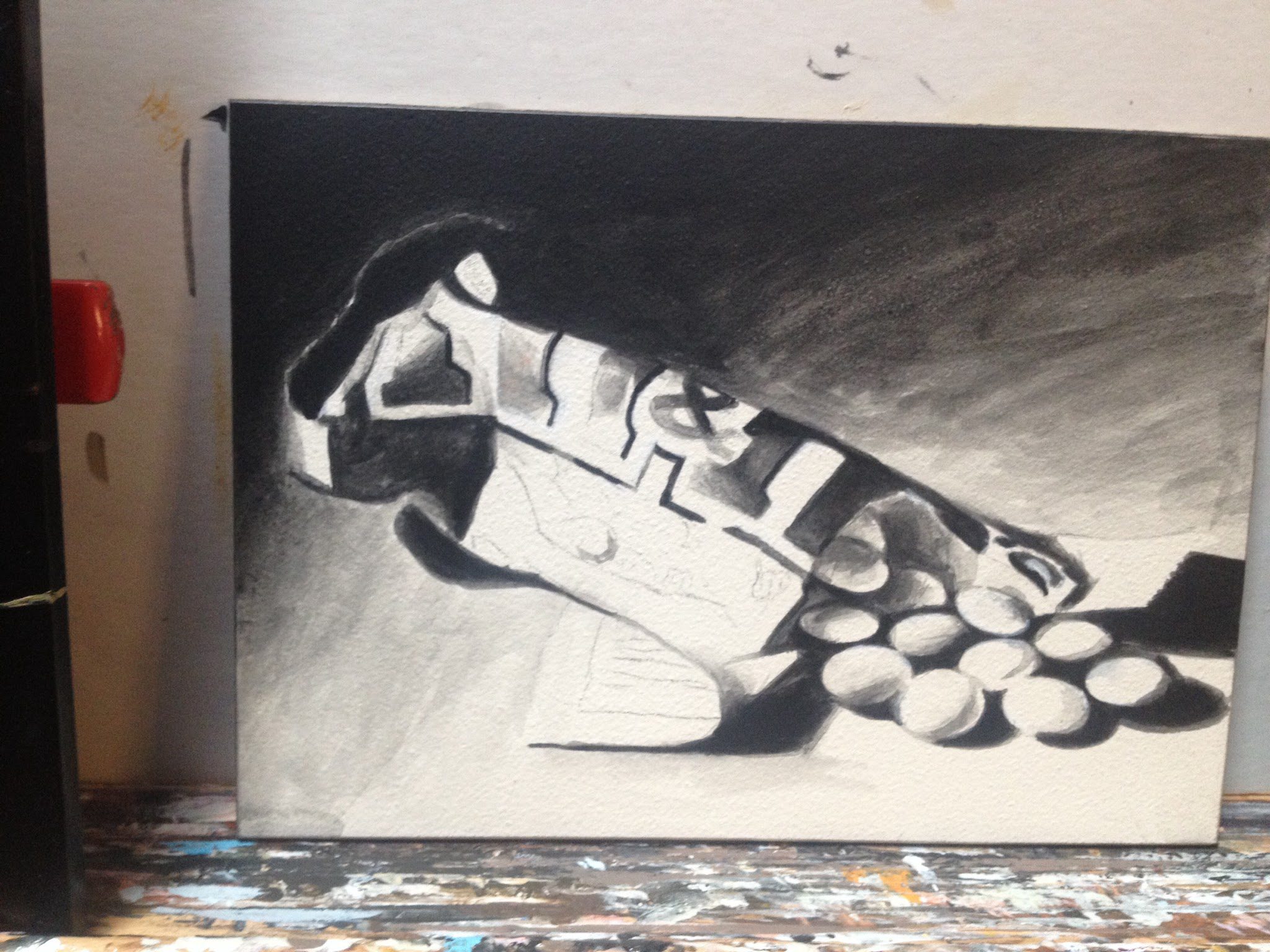
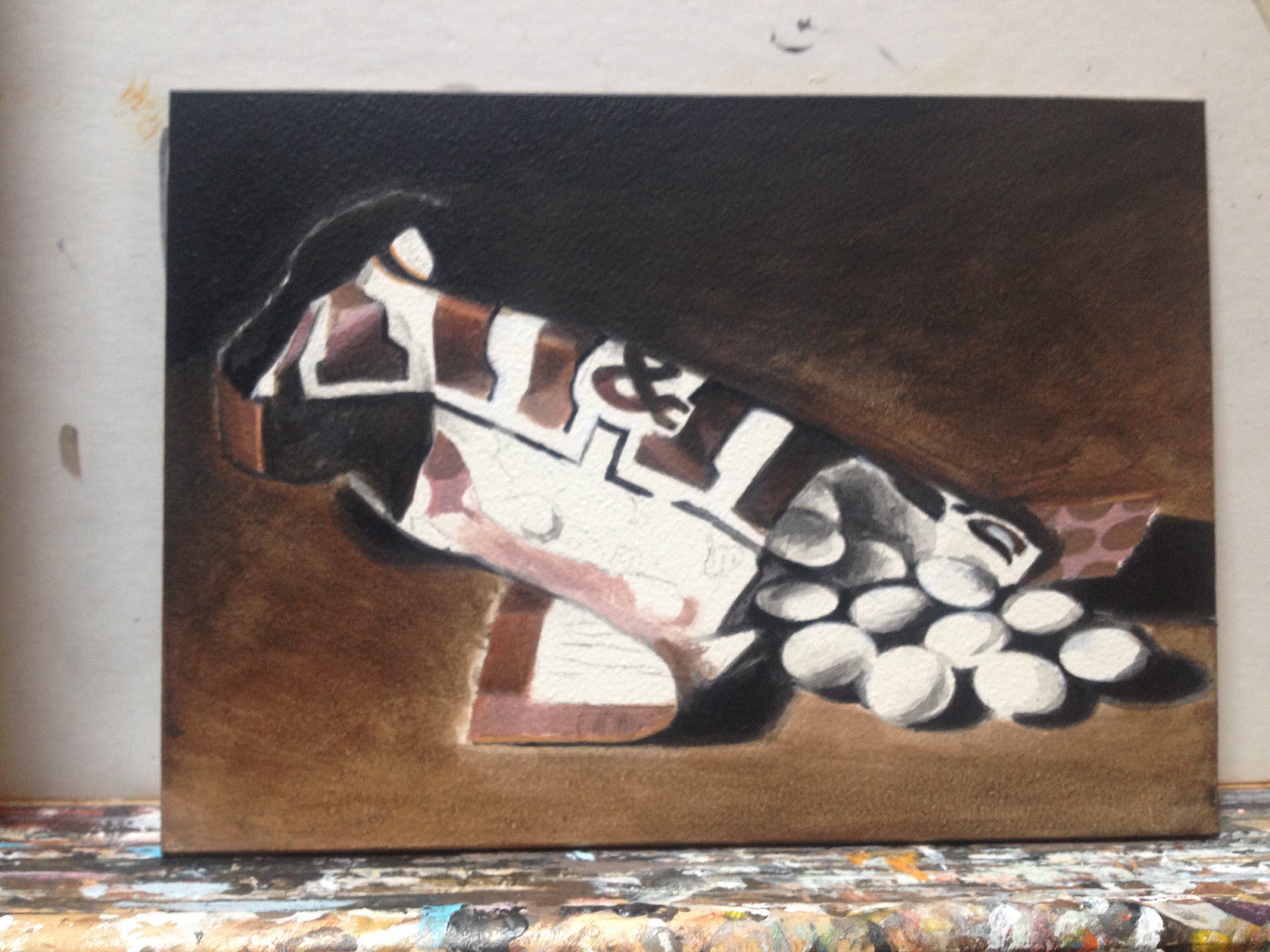
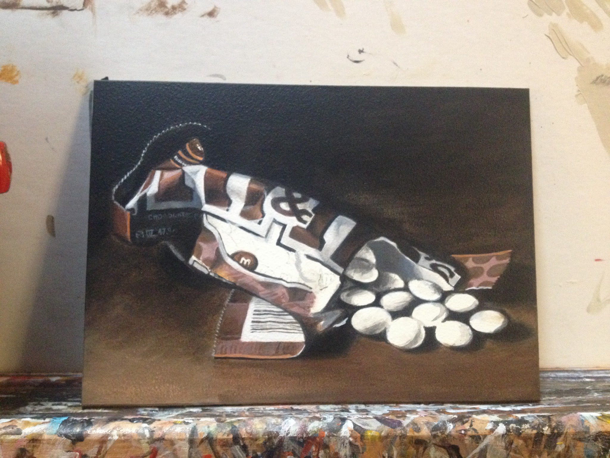
4. Again, it’s easy to rush through this before moving on to the brighter areas of the painting, but it’s best to take your time and get it right, building from dark to light throughout the painting. I can still fix some of it later if needed, but I try to get it right in most areas early on.






Leave a Reply